I recently finished getting a certificate from MoMA in Postwar Abstract Painting and wanted to take this opportunity to share more about my experience with this course and what I’ve learned.
First of all, this is a great course! Not only that it offers practical skills knowledge like how to mix paints, how to treat and stretch a canvas, or how to replicate in one’s own studio the techniques from internationally acclaimed artists; but it also educates in art history, history, color theory, and culture.
What inspired me to take this course was not only my passion towards abstract expressionism, but also two art exhibitions which profoundly moved me and transformed me: Beyond van Gogh the Immersive Experience (in person) and Satyricon vs Munch (virtual). Continuous learning for me is always welcomed; especially in a world where all we see is “fast conversations”, “fast food”, “fast fashion”, “fast entertainment”, I like to take the metaphorical “scenic road home” and spend some time simply contemplating the beauty around me in all its forms – like art.
This course offers an in-depth, hands-on look at the materials, techniques, and thinking of seven New York School artists, including Willem de Kooning, Yayoi Kusama, Agnes Martin, Barnett Newman, Jackson Pollock, Ad Reinhardt, and Mark Rothko. While I was familiar with the works of Jackson Pollock, Willem de Kooning and Mark Rothko, the other four artists were wonderful new discoveries to me. I totally enjoyed being transported into all these artists’ worlds through gallery walkthroughs, video interviews, and studio demonstrations.
Besides the theoretical knowledge, I also loved following along each lesson with hands-on practice by applying the techniques learned in the studio sessions. This also opened up the door for me to do further and more in-depth research into Abstract Expressionism and artists like Arshile Gorky and Henri Matisse, which I’ve already probably mentioned a lot.
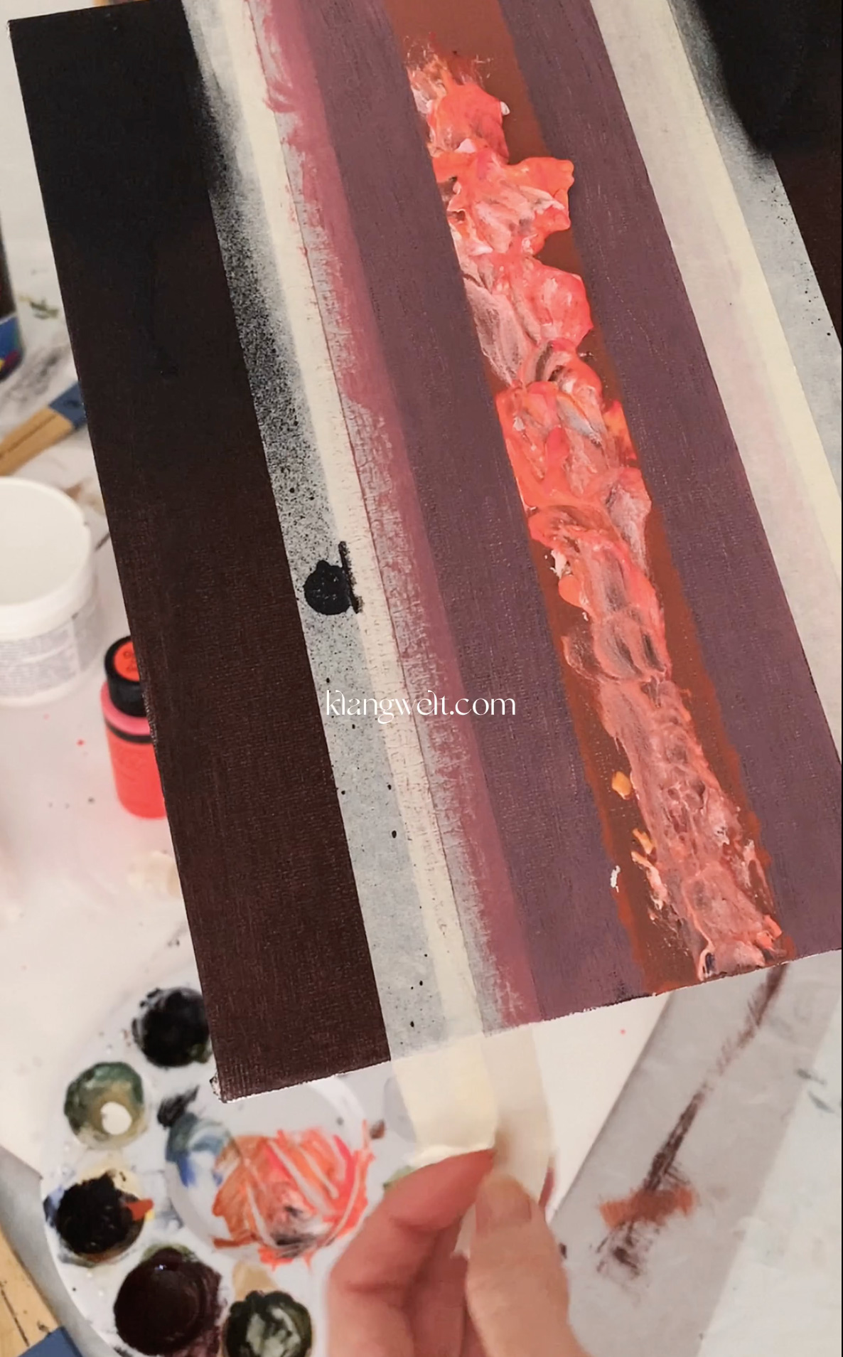
The concept behind this collage painting is a metaphor for compartmentalizing; and the many layers and dimensions to life, to people, and ultimately… to reality.
Similar to peeling the layers of on onion, we have to “peel” through layers from exterior to interior, from the outside in, from superficial to depth, in order to get to the core of a construct. In the same fashion, we have to peel through the layers of a person until we reach their core, who they truly are underneath all the substratum of societal pressures, external conditioning, expected roles, or inner self conflicts.
I started with painting a canvas panel with a mixture of acrylic black and tuscan red paint, followed by masking the center region of the canvas and adding a coat of pink. Masked the center again and painted with terra cotta paint. Waited to dry, then masked the sides and used black spray paint to create a splattered/dripped gradient on top of the painting. Waited to dry. Masked the center again and used a combination of crackle paste, glow in the dark orange paint, and glow in the dark neon pink paint to add the textured “zip” (as Barnett Newman calls the thin lines in his paintings) in the middle.

Removed masking tape and glued a strip of toned tan paper on the right, then glued a gradient cotton string on the left side “zip”. Painted over the paper “zip” with tuscan red mixed with a drop of black paint just enough to allow the irregular shaped paper tear to show through, creating more dimension and texture.
As a final touch – as one of my peers mentioned it – “but because you being… you” haha 😁 – I added a few splatters and drips around the glow in the dark textured zip. I did this also because I wanted to bring a little personal spin, as I always try to do to any work that I’m creating, even when I’m in learning stages, because it hurts to blatantly rip off another artist’s hard work and assiduously earned techniques. So I try to honor the artist, while still learning the best I can.


I don’t have much to say about this artwork other than it was made by using Mark Rothko’s painting philosophy of layering tons of thin translucent paint to create various color fields, each showcasing different color shades achieved through juxtaposition.

One of the most fulfilling moments (besides the studio practice of course) for me was the opportunity to pick one of the artists discussed in the course and to write an essay about one of their artworks not mentioned in the study material. As already a big fan of de Kooning’s art, I picked “Woman as Landscape” from 1955.
I find de Kooning to be a romantic at heart, staying true to the vision he held for his work even after he reached notoriety and acclaimed success. Willem De Kooning saw beauty even in the grotesque, which he considered joyous – and he depicted this by using bold lines against a backdrop of bright, contrasting colors.
His brush work might seem frantic and chaotic, but the warmth of his tones and expressivity of his gestures point towards a profound zest for life. Especially in “Woman as Landscape”, where he injects the abstract silhouette inside the idyllic setting of a landscape. It’s not about copying reality, but about bringing forth the dreamy feeling of being surrounded by beauty.
Even though de Kooning’s works have been accused of being misogynistic by some art critics, my opinion is quite the contrary. Through his abstractions of women’s bodies, de Kooning liberated the female form from preconceived standards or strict ideals of beauty, allowing it to unfold and evolve right on the canvas, in front of the viewer. In de Kooning’s “Woman as Landscape” femininity is unbound, unconstrained, and in permanent transformation.
[ … ]
After all, the magic of abstract expressionism or action painting is precisely this: the ability to convey gestural movement, musicality, and raw emotion through the vehicle of a static image.
⬆️ Read full essay in the document viewer above ⬆️
All in all, this course is totally worth it for anyone passionate about learning specific postwar abstract painting techniques and art history. The presentation is very professional, dynamic, and also packed with humour. Now every time I stab my toe in the nightstand in the dark I think of Ad Reinhardt’s Black Paintings – thanks, kind sir Corey D’Augustine 😅

Thank you so much for taking the time to read my thoughts. ❤ Please take a minute subscribe to the newsletter, where I share more useful tips, tools, resources, and discoveries from the art and design fields.